Logo Designs


Tri-Fold Corporate
Brochure Design
I designed a refreshed a corporate brochure that introduced a modern new branding look using the company’s corporate colors, layered shapes, textures, and updated imagery. This redesign helped overhaul the company’s visual identity and was later expanded into other marketing materials, including PowerPoint presentations and social media graphics, to create a consistent brand style across platforms.


Tucked Inside Panel
Back Panel
Front Panel

Inside Left Panel
Inside Middle Panel
Inside Right Panel
Holiday Email Campaign

Simple Joys was a December email campaign created to encourage the company's customers to slow down and appreciate the simple joys of the holiday season. The campaign consisted of four emails sent every 5 to 7 days, featuring seasonal recipes, thoughtful tips, and small reminders to practice kindness and self-care, such as checking in on others and taking time for yourself. The series was designed to create a warm, meaningful connection with customers during the busy holiday season.


White Paper
Brochures
I designed four sets of white paper brochures for different business segments, creating professional B2B marketing pieces focused on educating customers and supporting lead generation. Each white paper was designed to present detailed, solution-driven industry information in a clear and approachable format, helping strengthen the company’s credibility and thought leadership. The layouts balanced strong branding with clean structure and readability to ensure complex content was easy to follow and visually engaging.
Social Media
I manage the company’s social media channels by planning and maintaining the content calendar, creating original posts and branded graphics and videos, and scheduling content to ensure consistent messaging. Through strategic content planning and creative execution, I helped increase overall engagement by over 300%.


Billboard Designs
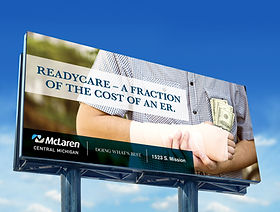
I designed three billboard campaign series (each consisting of three designs) for a hospital client in Michigan. The first series promoted the Emergency Department, highlighting its connection to a full-service hospital and reinforcing the facility as a trusted choice during emergencies. The second series focused on the launch of the hospital’s new ReadyCare location, emphasizing convenient care at a fraction of the cost of an ER visit. The third series supported a community awareness initiative addressing the rise of youth vaping, encouraging prevention and education to help protect local families.


Emergency Department Campaign


ReadyCare Campaign


Vaping Awareness Campaign
Company Re-Brand

I developed a full rebrand for Great Lakes Bay Health Centers, a Michigan-based healthcare organization, with a focus on creating an approachable identity that reflects their mission of providing care for everyone in the community. The project included designing a new logo featuring the shape of the Michigan state to emphasize their local presence, along with establishing corporate colors and a complete brand guide. I also created branded stationery and a flyer template to demonstrate real-world application, and collaborated with the web development team to help translate the new branding into the updated website design.


about all things design.


