
Faye Flam Website Redesign
Project Scope
Goal: Find a non-profit or business website that needed a re-design. Our job was to reach out to the non-profit or the business owner and interview them and see what they wanted for their website design and in return, we would give them our case study with our findings.
UX/UI Design team: Carol, George, Madisen, and Brian
Tools used:
Problem
Faye Flam is a scientific writer and podcast host. We found her website to be out of date, disorganized, and not visually appealing.
While conducting the initial user interviews, we discovered several things users were frustrated with and some things users liked. Building upon that, we asked ourselves the following question:
How might we help a user, (who could be anyone from a fan of her writing to a publisher looking for a freelance writer), find her articles and/or podcasts on her website fast and efficiently?
Solution
Organize the important information in a way that is easy to see on her homepage, but able to click on it quickly to find the articles and podcasts they desired to see/hear.
Organize the important information in a way that is easy to see on her homepage, but able to click on it quickly to find the articles and podcasts they desired to see/hear.
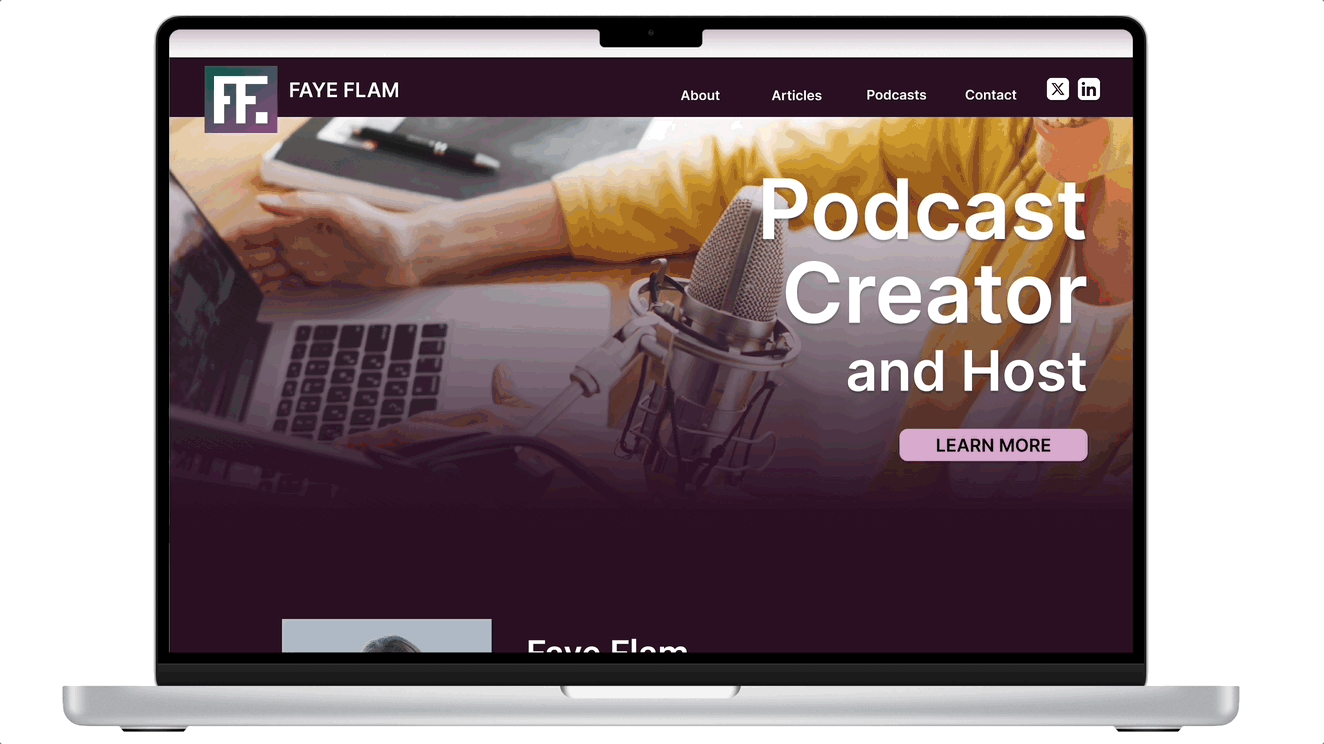
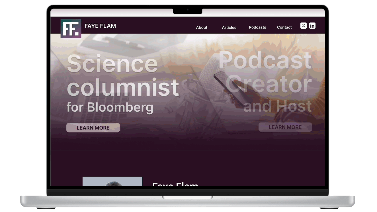
Carousel images to quickly describe what Faye does and connect option at the bottom of the page
'About Me' snippet on the homepage, with the option to navigate to learn more about Faye
Quick access to Faye's articles and podcasts from the homepage, with the option to click and see more
Impact
The goal was to make it easier and faster for people to navigate Faye's website. We chose a specific path to follow and timed users to follow it with the original website and our new design. We were able to help users along this path by decreasing the time by 3 seconds.
Research Process
Since several possible users could visit Faye's site, we asked her personally who she thought would most likely visit her website. Using the current website, we also interviewed several people asking specific questions about the usability, navigation, organization, etc. We opted to do this in place of a competitive analysis.
From that, we determined a user persona - Keith Jones, and editor of a popular science periodical.
User Interviews
From the initial user interviews, we were able to determine key points to work on and features to keep and incorporate in the new design.


Improvement Examples: Move articles further up the page and have more variety in featured articles


Keep Examples: A few options to keep - featured articles on the homepage and article categorization
Affinity Diagram
By grouping similar responses together, we determined what would be priorities for the website.


User Persona
Meet Keith Jones
Editor of a popular science periodical
Keith’s main goal is to get information from Faye’s website quickly and efficiently to make a decision if he wants to work with her on a freelance basis.
-
Keith is looking for established freelance writers because they require less training and no extra costs outside of their 1099 pay
-
Likes to have a pool of credible writers to utilize depending on the article he needs help on

User Empathy Map
To get a deeper understanding of Keith and what exactly his purpose is in visiting Faye's website, we created an empathy map of what he says, thinks, does, and feels. By diving more into those things, we were able to better pinpoint what his goals and pain points are.
User Journey
To gain better insight into the various feelings Keith may experience as he navigates Faye's website, we created a user journey.


Value Proposition
We needed to see if we were solving the issues users were having by comparing gains to gain creators, pains to pain relievers, and the customer's job to the products and services being provided.
Prioritization Matrix
After determining the changes we wanted to make, we prioritized them based on how high or low of impact and how much effort would be needed to make the changes.

Mid-Fidelity Wireframe
After our research, we were able to start our low-fidelity wireframing.


Usability Testing
To make sure we were on the right path in our redesign, we interviewed several people with specific questions regarding the following:
-
information presented
-
overall navigation, footer included
-
articles and podcasts layout
-
ease of possibly contacting Faye
-
social links
From that, we determined some iterations to improve Faye's website redesign even more.
Iterations:
-
Add Current Articles
-
Clearer description of what she does as a writer
-
Move the category boxes, make the user want to click them
-
Rearrange the layout and organization of the home page
-
Incorporate the typed phrase into a more detailed biography more towards the top
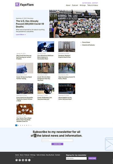
Original Website
Original Homepage

Original About Me Page

Original Articles Page
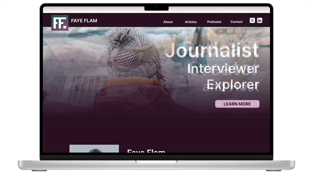
Final Website

Reflections
Overall, our website re-design got great feedback. If our team had more time, there are a couple of things we would have added to make Faye's website even better.
One thing is having her partner with other scientific authors and add a section under her articles named "Other articles you may like." The idea here was to have them do the same and create more exposure for all of the writers involved.
Because Faye is a scientific writer who has experienced many crazy adventures due to her career, our team would encourage her to share more photos of those experiences to connect with her users more.
We would also encourage her to create other social media profiles and keep them up-to-date so that she can share them on her website and possibly connect with her users on other platforms.