
Government Website
Redesign
Project Scope
Goal: Pick a government website and redesign the homepage, focusing on the navigation of the website.
Project Manager: Carol • UX/UI Design team: George, Madisen, and Julia
Tools used:
Problem
The Department of Interior website has a ton of information available to users. While looking at it, our team discovered it was hard to find specific things.
We conducted usability tests to have a point to start at. From that, our team was able to determine the initial steps to take to make the navigation more user-friendly.
Solution
Create a homepage that includes:
-
Easy navigation that makes it easier for the user to find what they need
-
Colors that align more with nature
-
Content hierarchy
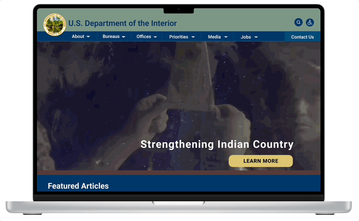
The new Department of Interior homepage has simplified navigation and highlighted information easily accessible.
Research Process
Research Objective
As user researchers, our team wanted to uncover how to simplify the navigation for the homepage and make the feature articles, priority issues, and ways to join the DOI.
User Interviews, Affinity Diagram, and Feature Prioritization Map
From the initial user interviews and their responses, we were able to determine key points to focus on by creating an affinity diagram and then their priority with a feature prioritization map.
-
Simplify navigation
-
Change up the page layout and add dynamic photos
-
Make the search bar less visible since it takes you out of the website
-
Make sure the UI designs are AA compliant


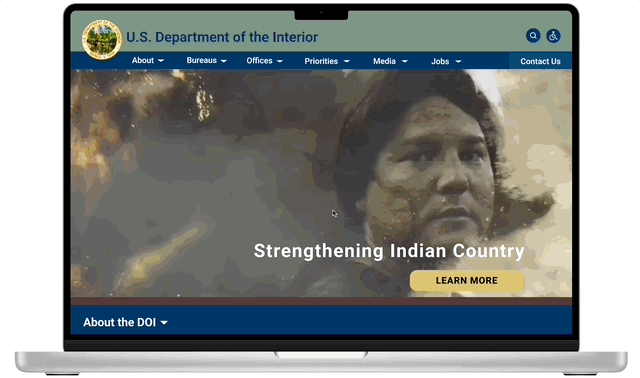
Examples of feedback from initial user interviews of current homepage

Meet Sarah
24-year-old Native American grad student at Texas A&M who's looking for an internship in a Native American community
Pain Points
-
Having trouble finding information on internships through the DOI website
-
DOI only has information about the program, and no opportunities are listed
Behavioral Demographics
-
Single and able to move easily for an internship
-
She's passionate about education
-
Outdoorsy and loves the environment
-
Her Native American roots are extremely important to her

User Empathy Map
To get a deeper understanding of what our user's purpose is in utilizing the Department of Interior website, we created an empathy map of what our user says, thinks, does, and feels. By diving more into those things, we were able to better pinpoint what their goals and pain points are.
Heuristic Evaluation
Our team dove deeper into the existing website to evaluate what wasn't working and confirm where our research was leading us.
Key points:
-
Separate Bureaus and Offices into separate categories and create separate drop-down menus for each
-
Hide the search bar since when it's used, it takes you out of the site
-
Make the drop-down menus vertical instead of horizontal
-
Find a color palette that represents a natural, environmental entity while still being a government agency website


Site Map
To ensure each sub-page was categorized correctly and that we were on the right path to improving the DOI website, we created a site map to use as a guide when we started wire framing.
Low-Fidelity Wireframing
Now that we had a better understanding of what exactly we were improving, we started low-fidelity wireframing.


Style Guide and Colors
In order to begin our high-fidelity wireframing, we developed a style guide.
High-Fidelity Wireframing
Once we had the style guide, our team was able to bring the homepage to life.

Feedback from user interviews of the redesigned homepage
User Testing and Iterations
When the high-fidelity prototype was done, we conducted several guerrilla user-tests to get feedback specifically on the navigation and asked about specific paths throughout the website.
Final Website

Future Opportunities
Overall, our team is proud of the improvements we made to the Department of Interior's website. We organized the navigation better which makes it more user-friendly. There are a few things we would like to build upon with more time.
First, we would like to go through all the pages and work on information hierarchy, along with the scale of the images in relation to the information it's presented with.
Second, we would love to create more videos to use on the homepage that relate to the various priorities and give the user the opportunity to click "Learn More" to go directly to that particular webpage.
Third, we would want to build upon the job search page and better organize that information so it's more user-friendly.